Designing a business intelligence dashboard to measure trajectory at a glance
Problem
Following the acquisition and amalgamation of four companies, senior leadership were reliant on a series of disconnected, time-consuming reports to track our business - leaving them with, at best, a siloed view.
We needed to aggregate our business intelligence data so that everyone was working with the same information.
After a leadership change and team reorganisation, I was asked to support the creation of a weekly reporting dashboard. After speedrunning the Qlik Data Analyst course, I took on the complete extraction, transformation and load of the data - as well as designing the dashboard.
Discovery
Exploratory Analysis
The brief included aggregating key customer data from various sources/departments and plot on a unified chronological timeline. However, hidden in the simplicity are a number of not-insignificant challenges:
Customer projects have different names and IDs in each system - no coherent link between data sources
Availability and frequency of data differs per department
The attributes of each project (size, scale, budget, type) can be wildly subjective; what’s normal on one project could be catastrophic failure on another
Stakeholder interviews
Whilst the majority of the KPIs were pre-defined, I engaged a number of the stakeholders for the report and asked the following questions:
When you have access to this data, what are the key question(s) you are trying to answer?
Are there any graphs or reports that you look at on a daily basis and, if so, what are they (personal or professional, eg. Apple Health)
Strategy
❌ Reporting was siloed and it was hard to get a reliable picture of the business
❌ Teams were taking hours to manually create reports
❌ Senior leaders relied on a weekly update meeting and had no way to self-serve the answers they needed
There was an opportunity to save hours of time by aggregating the data and automating the reports:
Minimise the number of reports required
Minimise the time it takes for stakeholders to read and understand the current trajectory of KPIs across all departments
Maximise understanding of current business performance

Solution design
Tackling the project ID problem
The first customer touch point is when a Salesforce opportunity is raised - so I used this as the basis and append all following IDs to. However, not all of the systems stored a Salesforce ID.
After discussions with the Chief Architect for UK Payroll, it was clear that there was no choice but to maintain a spreadsheet to join the IDs and enable us to filter the data for any individual production.
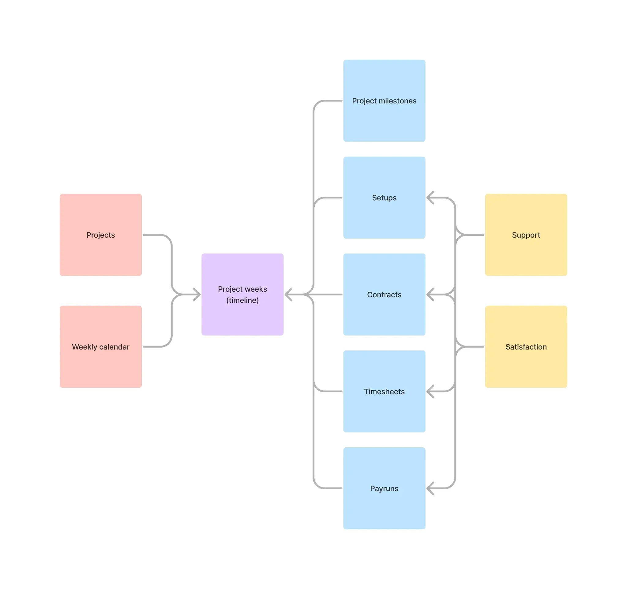
Simplified data model diagram
There are two key tables:
Projects; for all the IDs and other project-specific attributes
Weekly calendar; onto which I can join all activities
Then I can join a series of timeline events onto the calendar, grouped by the project and the week, to reflect product and service use:
Project milestones and key dates
Setups conducted by various teams (and the time taken to do so)
Contracting and Timesheet metrics (and other product usage stats)
Pay runs and payments
All support and related customer satisfaction results
Reporting UI
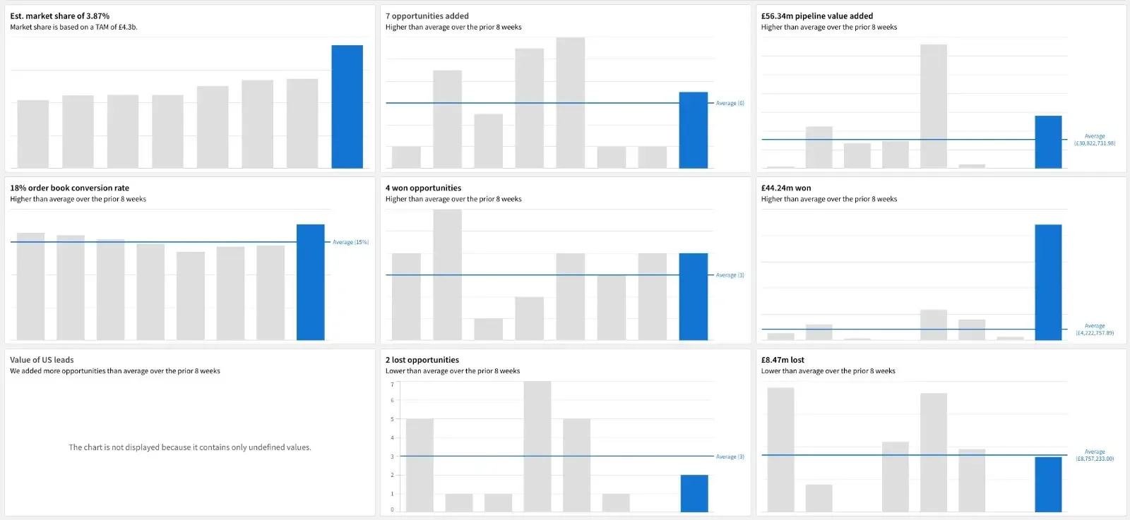
Based on the interviews I conducted with stakeholders, the key theme was about measuring trajectory. It was no surprise the the chart design that tested the best among the group included:
This week’s total as the title of each chart, eg. “4 won opportunities”
Created a dynamic description to explain the result (eg. “Higher than average…”)
Overrode the colour scheme to highlight the most recent week, greying out the previous seven but leaving them visible for fuller context
Calculated the rolling eight-week average as the primary comparison
Results
Minimise the number of reports required
Reduction from 6 reports to 1 dashboard
Minimise the time it takes for stakeholders to read and understand the current trajectory of KPIs across all departments
Reduced from up to a week to minutes (the time it took them to log in to Qlik)
Maximise understanding of current business performance
100% of stakeholders (all users) agreed they had a clear view of the business
Reflections
Unfortunately my role was made redundant jut prior to the release of this dashboard, so I never saw it to fruition. However, in the few weeks working on this I learned:
Designing the data model in advance enabled me to move very quickly (aggregating all of the data in less than two weeks), as it kept me on task
Even though the KPIs had already been captured in the brief, there is no substitute for engaging stakeholders - their responses really shaped the first version of the report